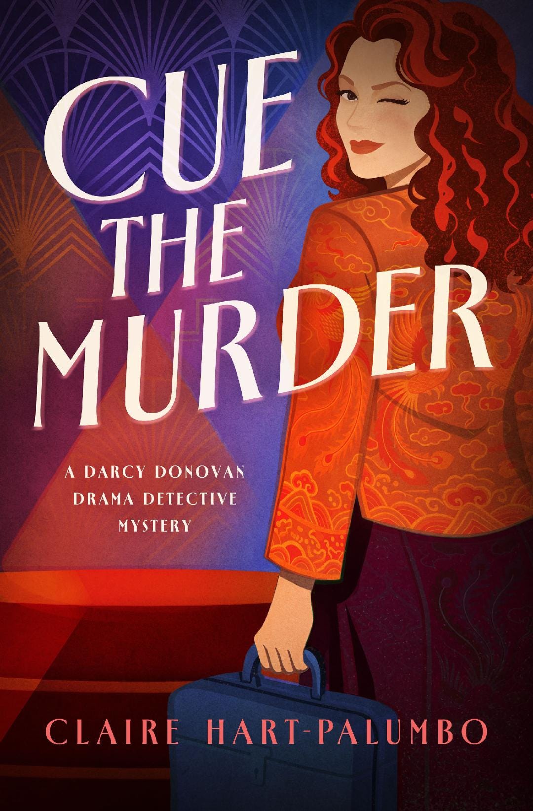
Cover Design
Overcommunicate from the beginning

When I signed my contract with Sibylline Press, I understood that I would be working with award-winning cover artist Alicia Feltman. One of the big selling points when I first started conversations with Sibylline was the quality of their overall look and feel and the stunning cover art. I was so excited as we approached the time when I’d get my cover, it was as if my body was humming.
First, they asked me to complete a detailed online survey about the characters in the book, key objects, stand-out moments or imagery from the plot, etc. I was also given a link to an online folder to upload images to support the survey. I combed the covers of recent Sibylline books and referenced the color palette of one specific title. I did note that the book was more serious than mine and that the quirky, comic tone of my book might mean going with lighter tones of the colors. I sent an image of another press’s cover and a pre-Raphaelite painting to suggest the hair of my main character. I mentioned specific items of clothing, like a sapphire blue satin, knee-length Chinese tunic/jacket with side slits and frog closures. I sent images of a vintage Samsonite make-up case in blue and cream, as well as pictures of a 1979 VW Bug, which in my book is covered with graphic advertising in the form of a Flintstone-like arm holding a giant fried chicken leg. It becomes a major plot point in more than one place.
I went to Houston and dragged my friend Carla all over town taking pictures of Victorian and Craftsman architecture as well as the facades of many of the theaters in town.
I uploaded all the images. A couple of weeks later, there was some indication that they didn’t have everything. So, I went through the whole process again. Eager to talk through the images with Alicia.
My editor and the copy editor sent formatted copy of the interior of the book. I went through two sets of edits, looking for minor corrections and formatting issues. Everything seemed to be chugging along.
Then the week I was to interact with the designer on the initial image came and went. I reached out to Vicki DeArmon, to see if there was an issue. Another book had been added to the fall roster, pushing my book back—cover would come in two weeks. When it did, I was somewhat dismayed.
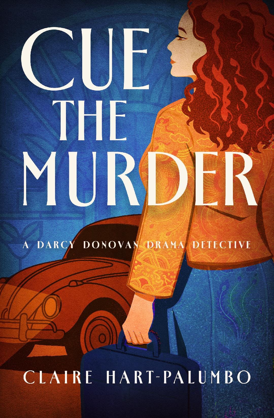
The palette was exactly the same as the go-by, not lighter tones. The female character was curvy as described but actually looked stocky. Her hair was auburn but looked heavy rather than like a ‘cloud’ around her head. More importantly, her face was turned away and looked way too serious. The VW was prominent but did not have any comic ads on it. The make-up case looked more like a briefcase. Art Deco design became texture in the background. There was nothing about this that said ‘comic’, ‘whimsy’, or ‘theatre’.
I pushed back by return email to Vicki, expecting to be able to talk to the designer. Her response was somewhat cryptic and did not offer any interaction with the artist. She promised to forward my concerns. I got a new version, color even darker, minus the VW and with some indication of stage lighting, which I’m not sure will read to a non-theater audience. But the figure still looked to be 50 not 32 and there was no indication of humor or whimsy.
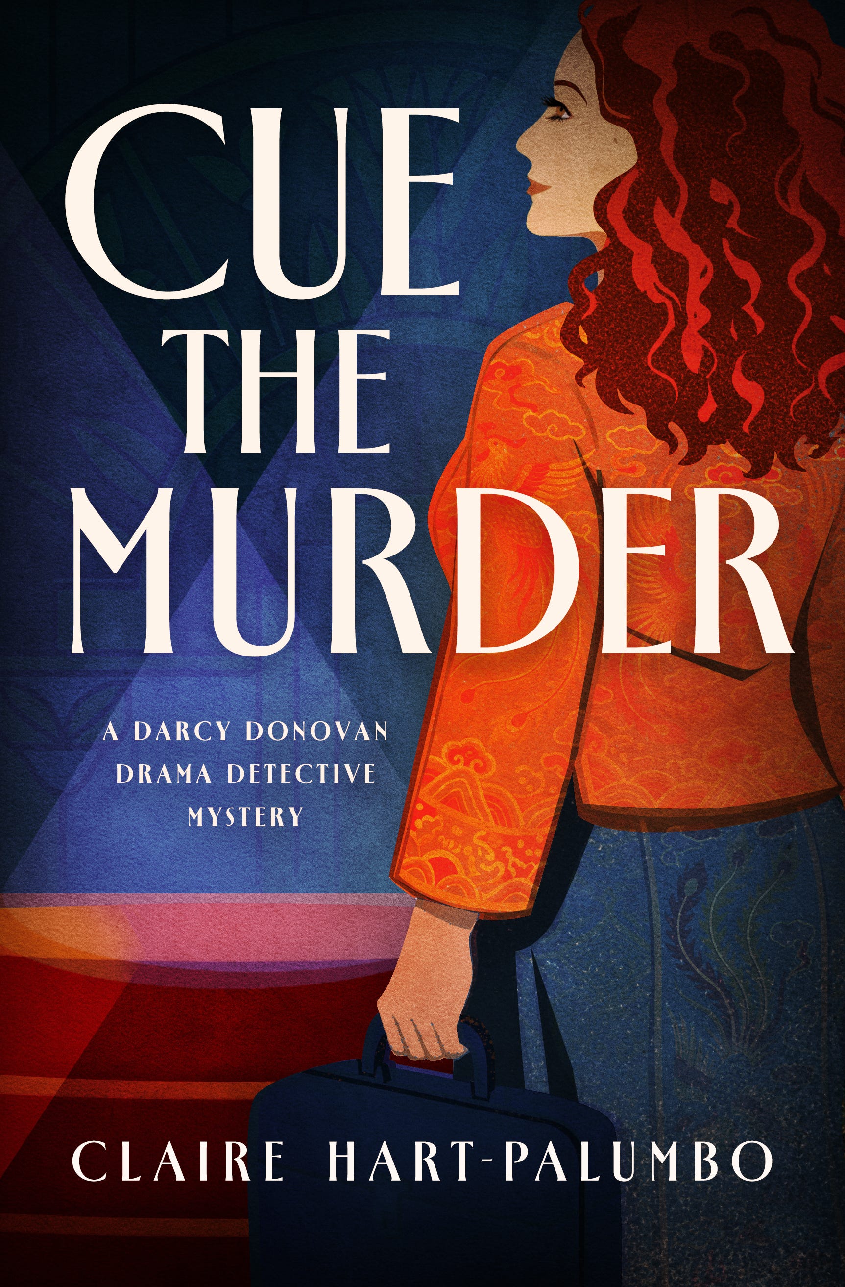
After a rather lengthy response expressing my concerns about this appealing to the audience I hoped to bring to the project, I got reassurance from Vicki that they wanted to make me happy, but time was critical. This was the final version. At last, there is some sense of the fun and quirkiness in the book. It is not everything I wanted. But it is a major step in the right direction.
What do you think?